Responsive Design - Why It Matters And How To Pick The Right Template
A website that doesn’t adapt to different screen sizes is losing visitors and potential customers. Today, users browse the web on a variety of devices, from smartphones and tablets to desktops and smart TVs. If a site isn’t designed to provide a seamless experience across all these platforms, engagement and conversions will suffer.
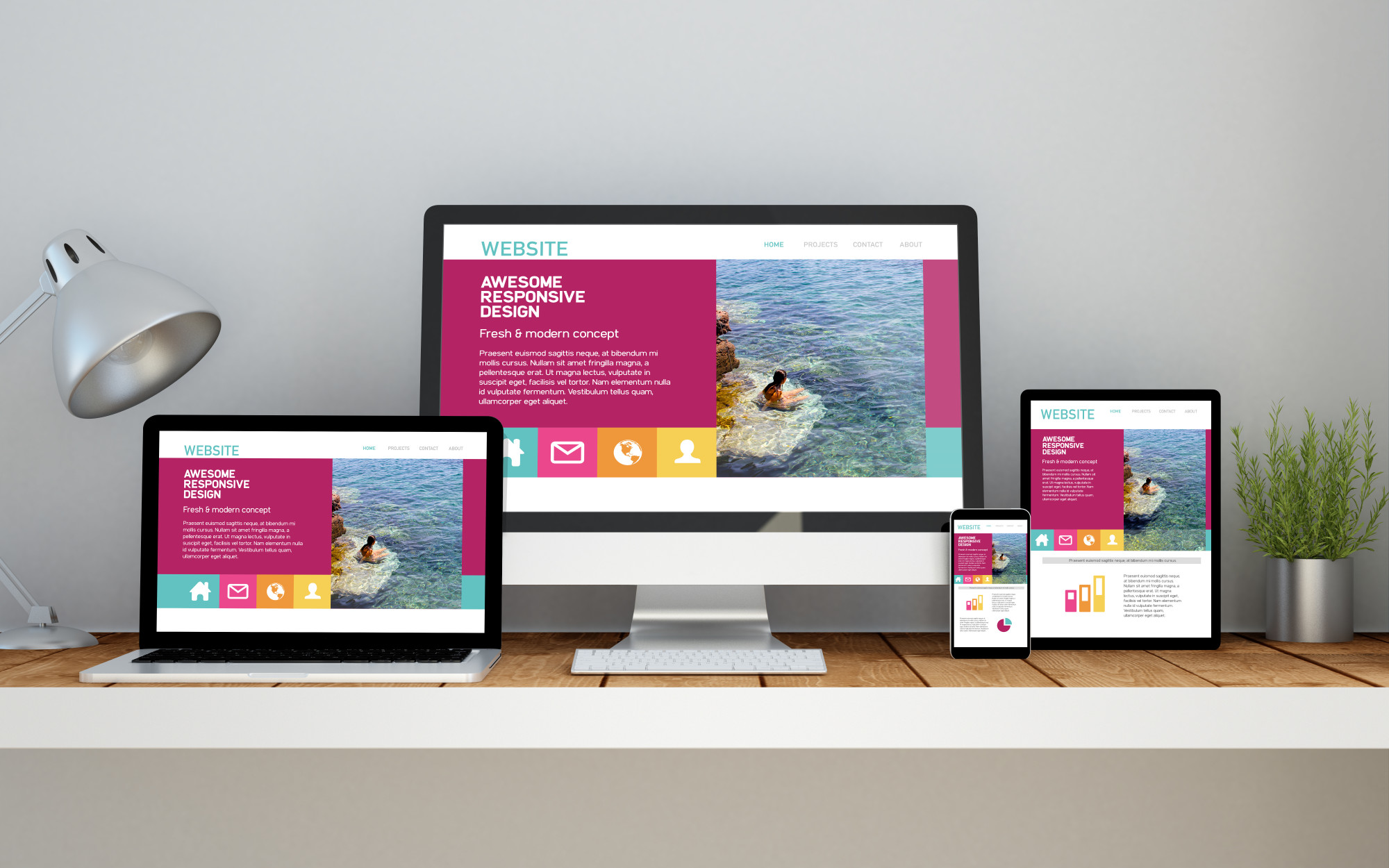
Responsive design ensures a website functions optimally on any screen size, improving user experience and boosting SEO rankings. This article showcases why responsive design is essential and provides a guide on choosing the best template to meet business and user needs.
What Is Responsive Design?
Responsive design is a web development approach that allows websites to adjust dynamically to different screen sizes. It uses flexible grids, fluid images, and media queries to ensure content remains readable and visually appealing on any device.
Key Features Of Responsive Design
- Fluid Grids:Layouts scale proportionally rather than using fixed units.
- Flexible Images: Images resize within their container to prevent distortion.
- Media Queries:CSS rules adjust styling based on device characteristics.
- Touch-Friendly Navigation:Ensures usability on touchscreens with appropriately sized buttons and links.
Why Responsive Design Matters
1. Enhanced User Experience
A responsive website automatically adjusts its layout, text size, and images to fit the screen it is viewed on. This makes navigation smoother, content easier to read, and interactions more intuitive.
Visitors do not have to zoom in or scroll excessively to access information, leading to a more enjoyable browsing experience. Responsive design improves user experience, but equally important is maintaining authentic content across devices, which can be verified using AI detector free.
2. Improved SEO Performance
Google prioritizes mobile-friendly websites due to its mobile-first indexing policy. A responsive design helps websites rank higher by ensuring a consistent user experience across all devices. Instead of managing separate mobile and desktop versions, a single responsive website avoids duplicate content issues, strengthening search engine rankings. Improved user engagement, faster page speeds, and lower bounce rates further enhance search visibility.
3. Cost And Maintenance Efficiency
Maintaining one responsive website is far more cost-effective than managing separate versions for mobile and desktop users. A single site simplifies updates, requiring less time and effort for design modifications, content updates, and security patches. Businesses save money on development and maintenance while ensuring that their content remains up to date across all devices.
4. Faster Page Load Speed
Optimized responsive websites load faster, leading to better user experience and improved search engine rankings. Since responsive design uses adaptive images, CSS media queries, and efficient caching techniques, it reduces unnecessary resource loading. Faster page speeds enhance user satisfaction and reduce the likelihood of visitors abandoning the site before it fully loads.
5. Higher Conversion Rates
A website that looks and functions well on any device builds trust and encourages users to take action. A responsive design ensures that buttons, forms, and calls to action remain easy to use, regardless of screen size. Whether a visitor is making a purchase, signing up for a newsletter, or filling out a contact form, a responsive site streamlines the process and minimizes frustration. This leads to higher conversion rates and better business outcomes.
6. Future-Proof Design
With new devices constantly entering the market, a responsive website remains adaptable without requiring frequent redesigns. Instead of creating separate versions for different screen sizes, a single responsive layout ensures long-term usability. As technology evolves, responsive design allows websites to remain functional and visually appealing across a wide range of devices.
7. Increased Mobile Traffic
Mobile browsing has surpassed desktop usage, making a responsive website essential for reaching a larger audience. With more users accessing websites from smartphones and tablets, a mobile-friendly design helps businesses engage with potential customers effectively. A site that functions well on mobile devices reduces frustration and encourages visitors to stay longer, increasing overall engagement.
8. Better Accessibility For All Users
A responsive website improves accessibility by ensuring a consistent experience for all users, including those with disabilities. Proper text scaling, high-contrast layouts, and optimized touch interactions make it easier for visually impaired or mobility-challenged users to navigate. Compatibility with assistive technologies, such as screen readers and voice navigation, further enhances inclusivity.
9. Stronger Brand Consistency
A consistent brand experience across all devices builds credibility and trust. A responsive website maintains uniform colors, typography, and layout, ensuring that visitors recognize the brand no matter how they access the site. When users receive a cohesive experience, they are more likely to develop a positive perception of the brand and return in the future.
10. Competitive Advantage
Businesses that invest in responsive design gain an edge over competitors with outdated or unoptimized websites. A seamless experience across all devices encourages visitors to stay longer, interact more, and take desired actions. In an era where user expectations are high, a responsive website signals professionalism, reliability, and commitment to customer satisfaction.
How To Pick The Right Responsive Template

1. Prioritize Mobile-First Design
A mobile-first approach ensures the template is optimized for small screens before scaling up for larger displays. This improves performance and usability on smartphones, where most users browse the web.
2. Look For Cross-Browser Compatibility
A responsive template should function smoothly across various browsers like Chrome, Firefox, Safari, and Edge. Test the template using browser compatibility tools to avoid rendering issues.
3. Check Loading Speed
Fast-loading pages improve user experience and SEO rankings. Use tools like Google PageSpeed Insights or GTmetrix to analyze template performance and optimize assets accordingly.
4. Ensure Customization Flexibility
Choose a template that allows customization of fonts, colors, layouts, and features. This ensures brand consistency and adaptability for future updates.
5. Review Built-In SEO Features
A well-coded template should include:
- Schema markup for structured data.
- SEO-friendly URL structures.
- Proper heading hierarchy (H1, H2, H3, etc.).
- Clean HTML and CSS for fast crawling and indexing.
6. Accessibility & UX Features
Look for templates that provide:
- Clear and legible typography.
- Proper contrast ratios for readability.
- Keyboard navigation support for accessibility compliance.
7. Test With Google Mobile-Friendly Tool
Google offers a free mobile-friendly test to check a website’s responsiveness. Run your selected template through this tool to ensure it meets Google’s mobile usability standards.
Common Mistakes To Avoid
- Ignoring Speed Optimization:Some templates have excessive animations and scripts that slow down performance. Opt for lightweight templates optimized for speed.
- Choosing Style Over Functionality:A visually appealing template might lack essential features like proper navigation, SEO elements, or usability. Ensure both aesthetics and functionality are balanced.
- Not Testing on Real Devices:Simulators provide insights, but real-device testing on smartphones, tablets, and desktops ensures accurate performance assessment.
- Overlooking Regular Updates and Support: Templates need continuous updates for security and compatibility. Check whether the template provider offers regular updates and technical support.
People Also Ask
Is Responsive Design A Skill?
Responsive design is a part of web design. It helps developers create flexible content that functions on multiple devices. If you're a web developer or you want to become one, learning more about responsive web design can help you improve your web development skills.
What Is A Key Thing You Need To Know About Responsive Design?
Responsive sites are built on flexible grids, meaning you don't need to target every possible device size with pixel-perfect layouts. By using a flexible grid, you can change a feature or add in a breakpoint and change the design at the point where the content starts to look bad.
What Is The Best Resolution For Responsive Design?
Responsive Screen Sizes: Prioritize designing for your audience by adopting the most common screen sizes for responsive design ranging from 360×640 through 1920×1080.
Final Thoughts
Responsive web design is no longer a luxury; it's a necessity in our multi-device world. By ensuring your website adapts seamlessly to different screen sizes, you can improve user experience, boost SEO performance, and increase conversions.
When choosing a responsive template, focus on flexibility, performance, and user-friendliness. Remember, a well-implemented responsive design is an investment in your website's future success.
About The Authors

Steve MartinsI am a certified graphic designer and I earned my bachelor’s degree in Communication Design. I worked with many brands like Uniqlo and Huawei but also independent smaller Barcelonian brands like Caravelle and Madrid’s Hola Coffee and I have completed over 2000 projects in the last 5 years.